The New eBay
eBay relaunched their website with new features and enhancements.

The changes we’re making reflect the new eBay and our evolution as a marketplace that connects the world to the things they need and love.
Technology is enabling a revolution in how people shop, and eBay is enabling the future of commerce.
Read the whole story: http://www.ebay.com/new
Not every feature is already live! According to eBay they will be rolled out in the coming weeks. But you can see some of them here: http://www.ebay.com/feed
My opinion
It's a good step to finally change the old design to something more simple and modern.
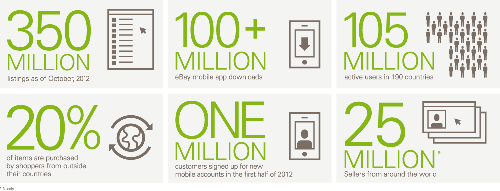
I think it's funny that they talk about new technology, but the site is not responsive and they use a static image to represent their eBay Today statistics on the new eBay page:

And what about this ugly use of the box-shadow:
box-shadow:
    0 7px 18px #323131 inset,
    0 -7px 18px #323131 inset
But it's a start.
What do you think?
Please drop a line in the comments!