
Visual User Training
"If you're instructing the user with text, you're probably doing it wrong"
[Context: Team meet for a smartphone game.]
Tip: Prefer familiarizing your users with your software using visuals/animation rather than lots of text. It's easier for users and may simplify internationalization.
We were discussing features related to a smartphone game that we're working on. One team member said that they got their friends to try and play the game to get some feedback.
"Some people try and tap the crate/box (and lift their finger as if it's a button), some people try and touch/drag the crane/hook."
(The game involves moving items on to a boat using touch gestures)
Another replied, "But we show a message when the game starts. It says 'Touch cargo to select and then drag to move it across. Release, to drop cargo onto the boat.' "

This is when I shared/coined a thumb rule to follow.
"If you're instructing the user with text, you're probably doing it wrong."
Most users don't have the time/patience to read through a bunch of text to learn how to do something. Or another way to put it is - As developers, we shouldn't expect our users to read through a manual. It's our responsibility to give them a path with least friction. This applies to many other types of software, not just games. Remember, while developing you know all the rules of the system. You're so close to it all. When your product goes out to the hands of end users, you want to make usage easy for them.

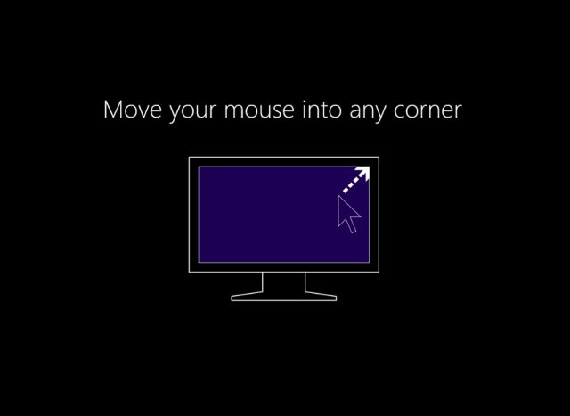
We're now changing the intro sequence to have an animation which will show a touch gesture starting on the crate and dragging it over to the the boat. This is similar to how some other games out there do it (eg: Dude Perfect). Windows 8's first launch "Move your mouse into any corner" animation is another example.
We've gone over solving this "problem" previously as well. The game has a few rules like placing a gorilla next to bananas gets him excited and he tries to move close to and eat them. In an earlier build, just a text popup used show up when the level (with gorillas and banans) began.

This was augmented with an "icon box popup" which tried to convey the message across with images. A user that skips over the text message notices this ("easier to process") communication every time the level is lost for this reason. Previously, a text popup used to tell the user why the level ended, now it's got the gorilla, a "chomp" icon and a half eaten banana.

A picture is worth a thousand words. Images are probably processed by the brain quicker than text - it's no surprise contact applications (contact lists on smart phones or web based systems like Google, Live etc) show a preview photo of a person next to their name when scrolling down the list.
Another benefit of such visual communication is that your internationalization effort may get reduced. App Stores (or distribution over the internet) reach a global audience - if you use text, you need to translate every message to languages of other regions where you hope to reach. With images, even the dimensions (screen real estate) of the 'popup' is consistent for all regions whereas with text a short message in one language might get translated to something much longer in another - affecting the layout of your interface.
All this ties in/leads to another possible rule - give visual feedback.


